Brief
Exercise 3: Three Figure Studies
Using a variety of tools, materials and supports, work on three large (at least A3) drawings of your model, using the following poses:

- Standing
- Seated
- Lounging

The aim is to make interesting studies of the figure to show you’ve understood the basic structural principles, and are able to incorporate these using whichever style or approach fits your subject.

Spend about an hour working on each study. Use poses that are comfortable for your model. Let them take breaks every 15 minutes or so.

Ensure you have a good light source to help you observe the tones and shadows that fall across and underneath the body, emphasising its structure, form, weight and position within the overall scene.

Before you start on the larger sheets, spend some time looking at the stance, posture, movement, or stillness of the figure. Move around the model assessing interesting viewpoints. Look for positions that may cause a challenge through foreshortening, for example lounging. Position yourself at a slight angle, so that you’re looking down, along and across the body in different ways. Observe the difference in the scale of the head and feet depending on your own viewpoint. Remember that there are often hidden parts that may be difficult to suggest, for example the shoulder furthest away when viewing from the side.

Draw small marks onto the sheet of paper indicating the outermost points of the figure (the top of the head, the angle of the shoulders, the tips of the toes, knees, etc.). This will give you confidence that you’ve measured the proportions correctly and that the whole body will fit into the rectangle.

Keep checking the body measurements up, down and diagonally, comparing one part with another, for example the length or width of the head compared to the hand. Remember that the lengths and widths that you see (the visual measurements) are often very different to the ‘actual’ physical measurements due to viewpoint and perspective.

While you’re drawing, think about the skeleton that supports the body and the muscles and skin that soften the shape into something living. Also look closely at the shapes between and around the parts of the body and the room.

Review your completed drawings and make some notes on your experience of this exercise in your learning log.

How accurately did you depict the overall proportions of the figure?

Did imagining the sitter’s skeleton and muscles help you to convey the figure’s structure and form?

How well have you captured the characteristics of the pose?

Does the body have sufficient weight and presence?

Do the proportions look right? If not, how will you try to improve this?

Can you tell from the drawings where the weight is being carried?

Does the figure feel connected to the world?

Tip: Measuring the Figure
The technique of measuring by holding a pencil against the thumb and then at arm’s length is a traditional method and used by many, but not everyone finds this useful, so careful observation of the subject should be your foremost concern. It is much better to use the body you’re drawing as its own measure. For example, you can measure the head and then use that as a unit against which other parts of the body can be double-checked. It is crucial to note at this point that gender, age, ethnicity, body weight, disability, and many other factors moderate any general rules of proportion you may come across.
I don’t have a model to work from but I’m interested in how the female figure is represented in women’s magazines. I discover I have access to the Vogue archives through my university and started to add images to my image folder. I’m sure it would be better to work from a live model but it’s a luxury I can’t afford.
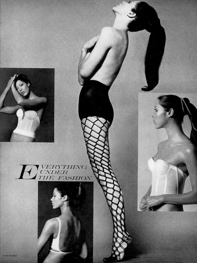
Standing figure
As a warm up I got “acquainted” with my model in my A4 sketchbook. I used a neon pink background (I love that colour!), and willow charcoal.
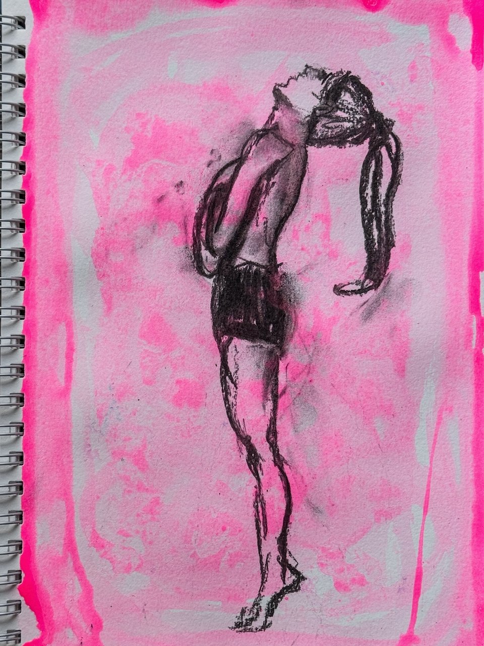
I liked the curves of the legs but I am aware this was not fully capturing the pose and the head is really out of proportion.. There’s a tension in the original photograph that my drawing did not capture.
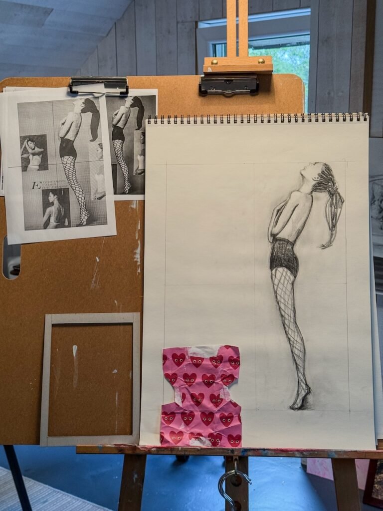
Next I decided to try and upscale but use a grid as a scaffold to me more precise. I thought that using a frame on my paper that had the same proportions as my viewfinder might help me with “finding my marks”.
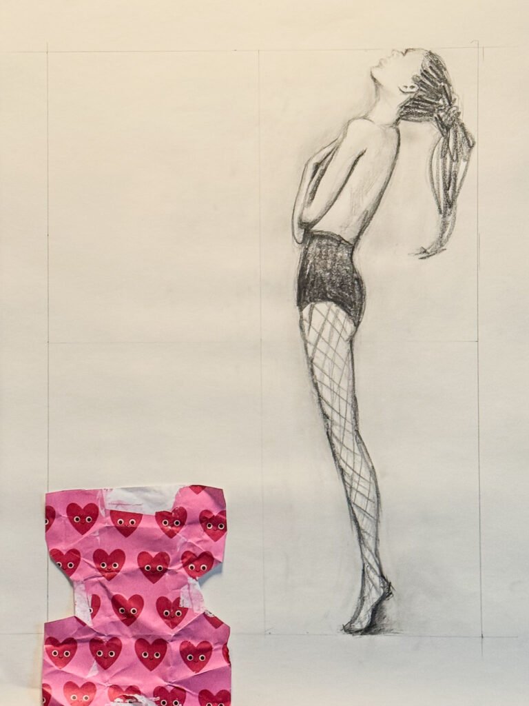
I used a graphite stick which allowed me to be more precise as well. I admittedly lost patience with the tights… I can see lots of departures from the model (the curve on the pants, the curvature of the front, the shape of the head, the curvature of the back…). The energy of the figure which got me to pick this image is lost in my depiction. Even the weight of the hair which seems to balance the position is lost in my picture which is still too straight. At this stage, I thought I should project the image on my page to get the lines “right” but then I thought I wouldn’t be learning anything doing that. However, I was frozen for days after that.
Two interesting insights came to me as this was hanging in the studio:
- I noticed how the photograph frames the model at the edge of the page, top and bottom as if she was “boxed in”. I can’t help by thinking about what conflicting message this is sending to women reading those magazines. There’s a feeling that she’s constrained in that box, she can’t even stand straight, even the tights look like she’s been tied up, ready to be slow-roasted.
- I saw a piece of wrapping paper on the floor and couldn’t help to placing it by the picture. I realised that once again I had paired bright pink and black. I have done this quite a few times now. There’s something I find pleasing about this colour combination as well as the graphic look of the paper next to the more fluid lines (even though they are not as fluid as I would like) of the drawing.
Sitting figures
I first started in my sketchbook, a grid, and a 2B pencil.
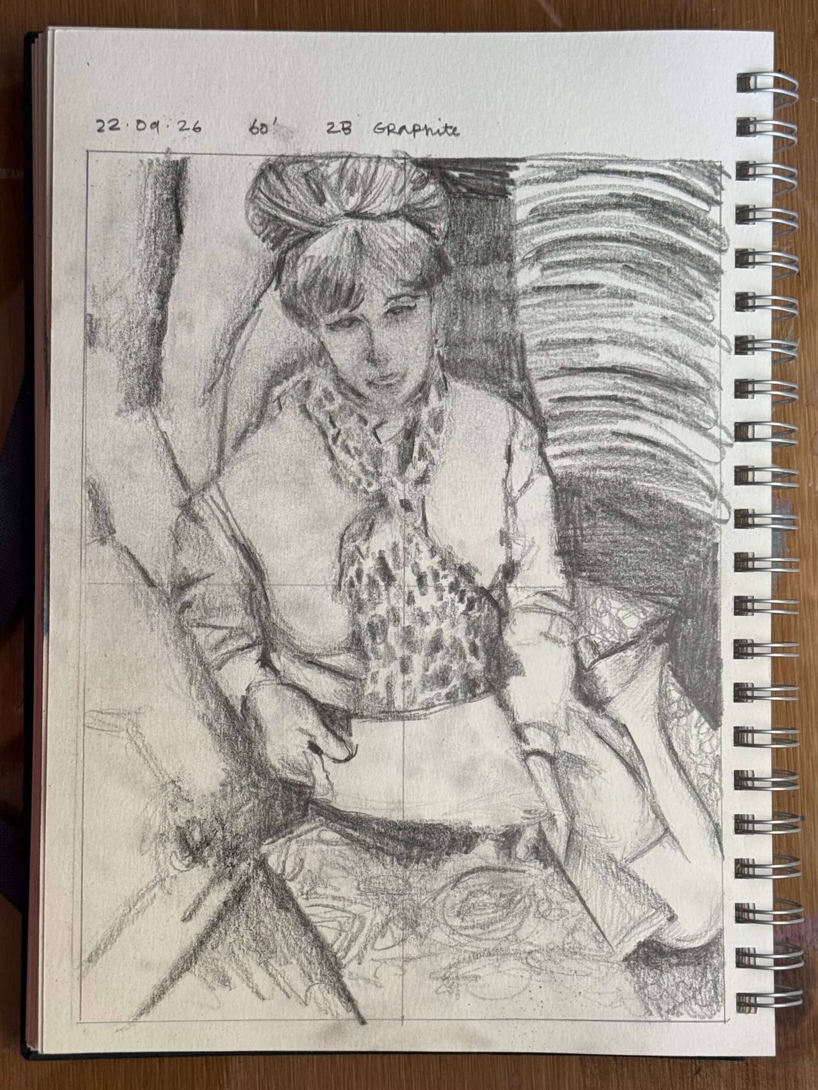
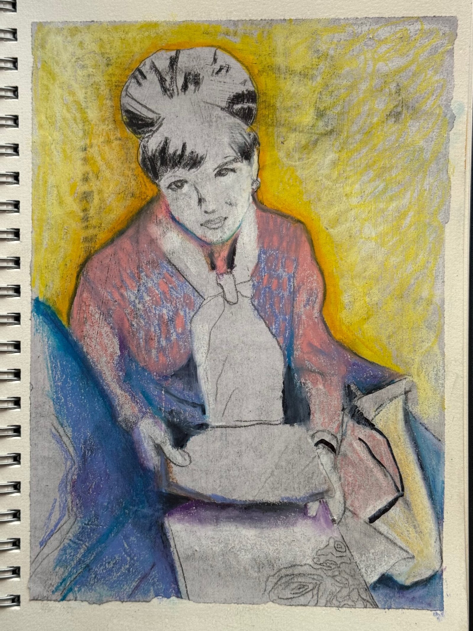
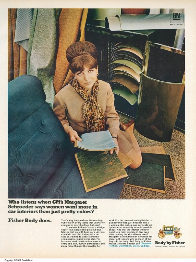
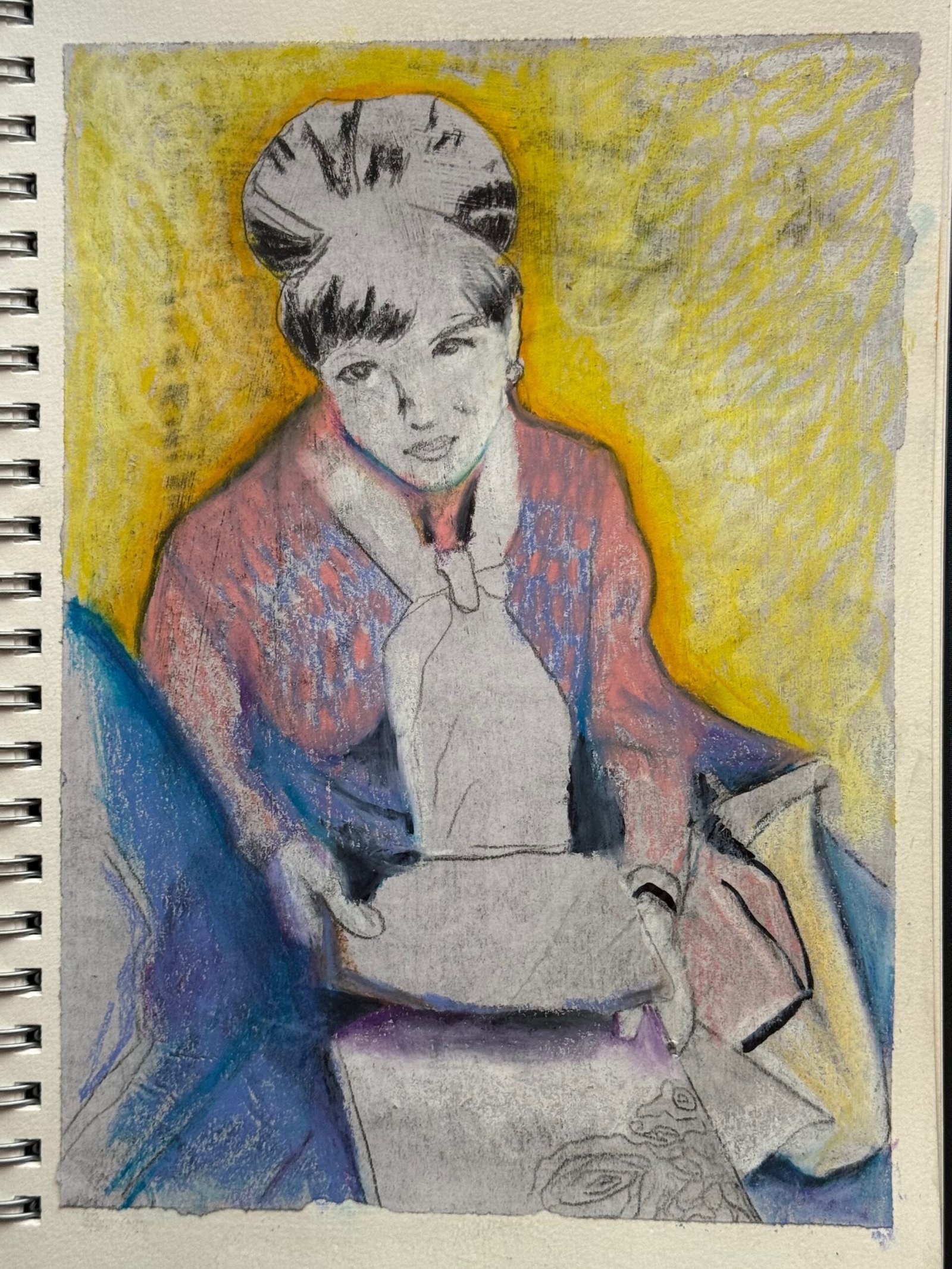
My first reaction is to feel very critical of the result. The proportions are wrong and her left shoulder feels too large. Her face is too grey. On second look, though, I feel I have captured the figure. We can see a woman sitting and looking up at us, holding some documents. The cropping was intentional too. She’s in a box, like the model standing. She’s interrogating us. I like her, I even like the goofy suit. It was not intentional but it contributes to the feel that she’s not in her element.
A few days later, I tried again. This time I used carbon paper to get the marks “right”. Then I continued playing with the drawing, pushing some dark areas using my neocolour II pastel crayons and a black marker towards the end. I like the end result even if it’s messy (It got messier as I worked on my next drawing on the next page. I did the transfer on a newsprint paper that had a photograph on the back, then I glued it in my sketchbook with modge podge before colouring it in. I enjoyed this process. I am not looking to create something that looks realistic or “perfect” but I’m not sure what I am looking to create, I feel a little lost sometimes, merely reacting to the image until I let go, finished or not, because I feel I need to move on.
Lounging figure
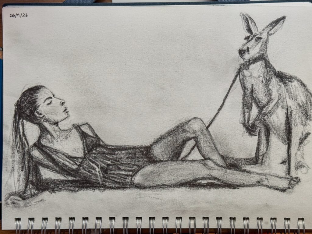
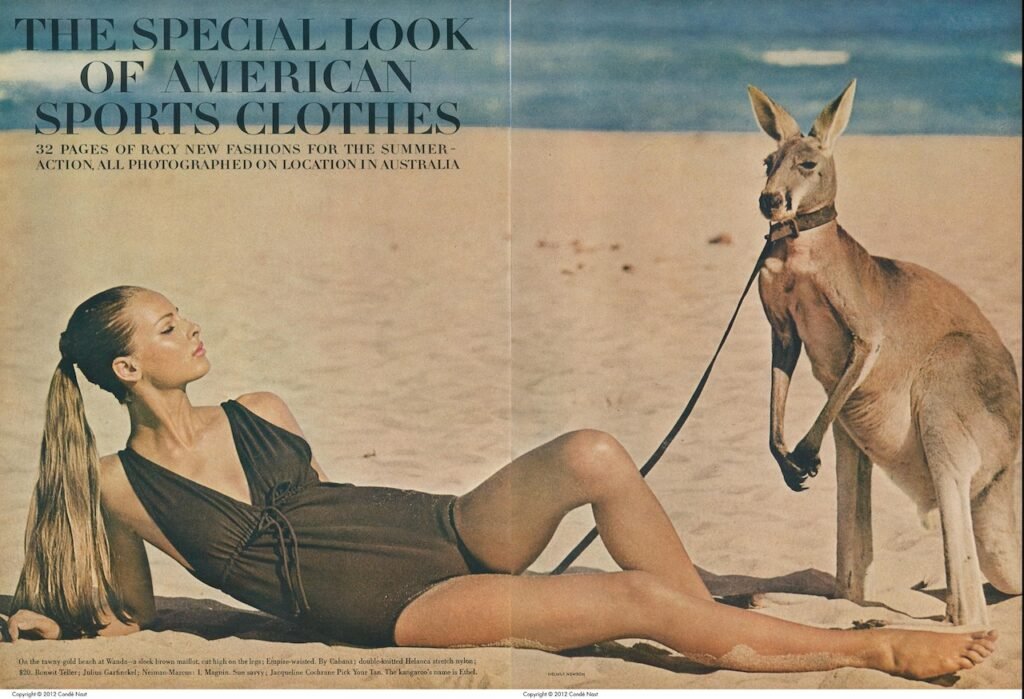
For the last study, I grabbed my 6B chunky graphite pencil and my electric eraser. I’m still struggling with the proportions(The front leg feels too small, the head too big). But I like the roughness of the mark making. I was trying to render the light. I’m quite happy with the neck and the face for some reason! At least they are recognisable.
Final thoughts
Reviewing my three studies, I tried to reflect on the exercise prompts
How accurately did you depict the overall proportions of the figure? Do the proportions look right? If not, how will you try to improve this?
Not very well! Not too badly either. It’s going to take a lot more practice for me to get there, if I ever do! I know the tricks, with the pencil or the frame but I don’t seem to be able to transfer this on my drawing (yet!). This being said, I’m not too far off (hopefully!). I think using carbon paper and/or projecting the figure to get the lines right might be something I need to use to scaffold my final piece.
Did imagining the sitter’s skeleton and muscles help you to convey the figure’s structure and form?
Not quite. I like to work from a noisy black and white photograph to see the shades. I work from forms and negative space rather than the underlying skeleton.
How well have you captured the characteristics of the pose?
So-so! I think the standing figure is still too stiff compared to the model. The sitting figure was challenging because of the unusual vantage point. I think I managed OK. The face expression in the graphite drawing was not quite right. It was better in the second version (in my opinion).
Does the body have sufficient weight and presence? Can you tell from the drawings where the weight is being carried?
Good question… I think when drawing I was more concerned with light and shadows than weight. I suppose for the lounging figure has more of a feeling of a weight because of the hard shadows at the bottom.
Does the figure feel connected to the world?
The standing figure was not connected to the world, which is possibly due to the reference I used although I could have added more shadows or context. The first sitting figure did appear in a busy context although not necessarily a clear one. The second version was more abstract, but I like this. I was not seeking to anchor it in the world.
Additional practice
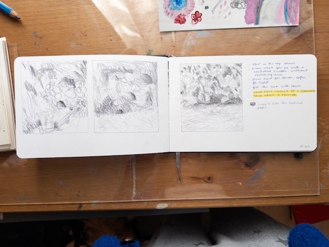
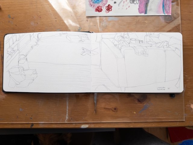
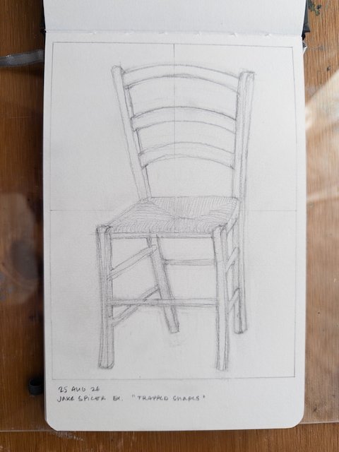
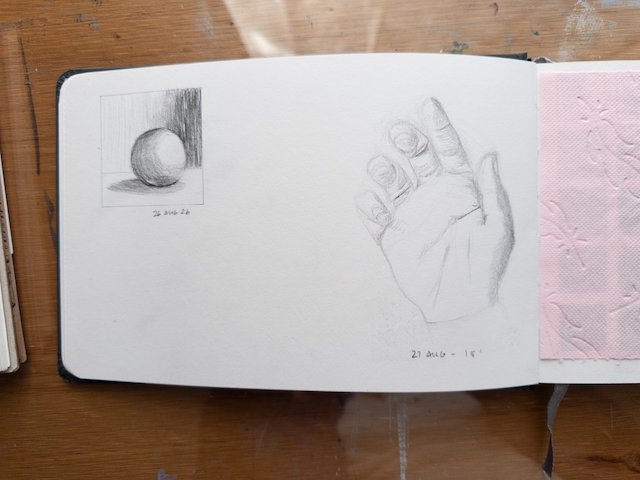
I feel I need to practice more and need to go back to basic drawing exercises in my sketchbook to keep me improving. To think art making is a source of wellbeing… Not always, sometimes it is torturous! I overthink and have too high expectations. Knowing I have to practice everyday is not the same thing as getting myself to doing it. I’m not sure how to transfer the practice to the project exercises.