Thiebaud’s painting of American desserts are mouth-watering even when you see them on a computer screen. This may seem banal at first but if you stop to think about it, it is quite remarkable to achieve this with a painting: to awake our senses of taste and smell, to recreate the embodied sense of arousal we feel in anticipation of a pleasurable culinary experience. How does he do it?
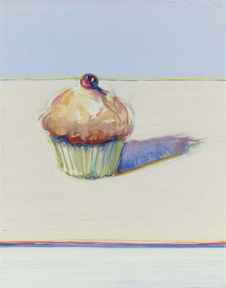
Thiebaud’s Cupcake presents a single cupcake on a flat pale yellow background which we guess is a flat surface only from the angle of the cake shadow. The wavy brushstrokes make the icing appear fluffy contrasting with the shiny cherry on top. The cake cup is made of thick impasto and precise lines which also contrast with the fluffiness of the cake top.
The colour palette is an array of tinted whites, from warm yellow on the top to cool blues in the background which creates a minimalist sense of depth and contribute to setting the mouthwatering cake as the focus of attention. The shadows behind the cake and between the cake and the cup are painted in a highly saturated blue purple which create contrast and volume but somehow almost a sense of… smell and warmth.
Cupcake also features Thiebaud’s signature “halation technique” which could have been inspired by Josef Albers’ theories on the relativity of colours. At least, that’s what Teagle (2025) suggests in her introductory essay “Wayne Thiebaud: American Still Life” for the recent Courtauld exhibition. The juxtaposition define the edge of the objects and gives them a shimmering visual illusion of movement which reminds me of the peripheral drift illusion or “rotating snakes” (Kitaoka and Ashida, 2003).
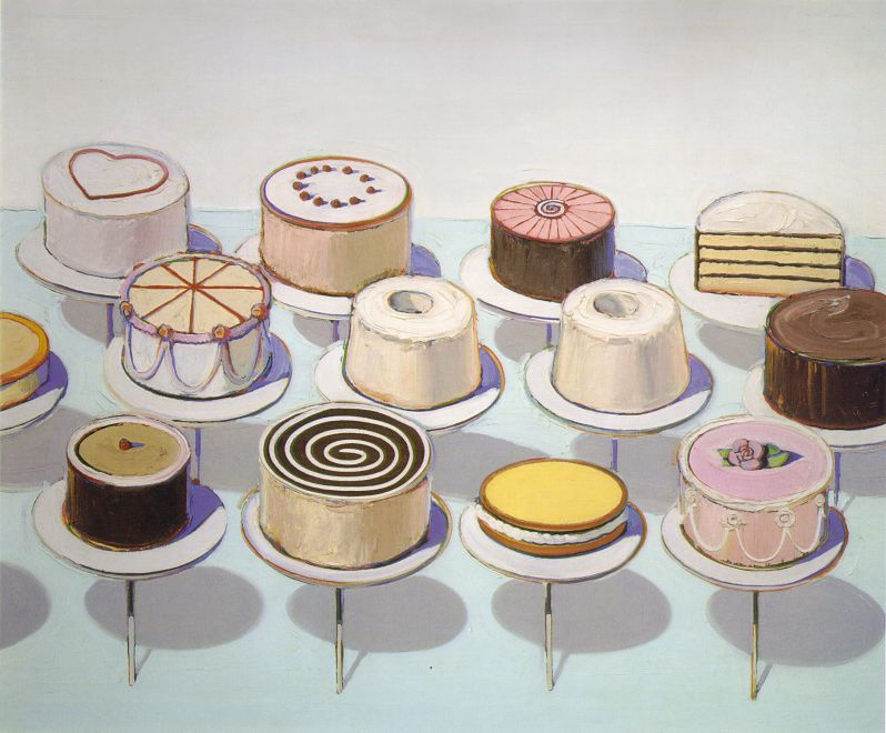
I think the illusion works to create a liveliness and life-like rendering of the subject which contributes to its mesmerising effect. Teagle (2025) quotes Betty Jean Thiebaud, filmmaker and Thiebaud’s spouse, who explained that the colours “peek through” because Thiebaud begins by drawing in colour, in lime green, yellow and orange before applying the thick, buttery layer of oil paint. In the catalogue entry for Cakes (1963), presented as one of “Thiebaud’s most significant paintings of the early 1960s”, Serres (2025, p. 120) explains how Thiebaud used paint, not only to depict, but actually decorate the cakes to express their exuberant sweetness:
Dosing his ingredients like a baker, Thiebaud varied the thickness of viscosity of his oil paint by adding Liquin, damar, linseed oil and turpentine.
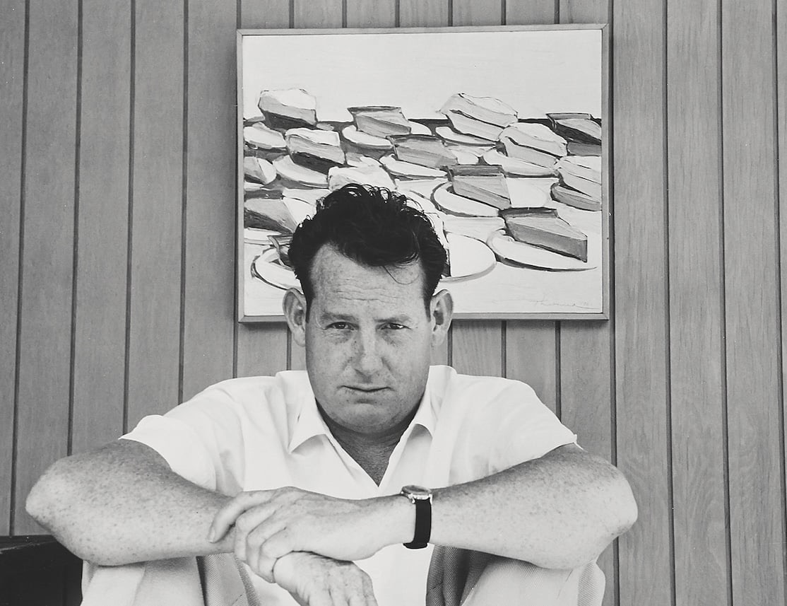
The one thing one keeps reading about Wayne Thiebaud is how he was once mistakenly considered a “Pop artist.” Looking at his early paintings now, it seems an oversimplification. While his paintings were depicting “consumables” at the same time Andy Warhol was printing soup cans and Claes Oldenburg was sculpting hamburgers (Christie’s, n.d.), there is a distinct painterliness in Thiebaud’s artworks. In an interview with artist Colin Smith, Thiebaud explained:
Pop Art, I have not much interest in it; I’m not a big fan of it, partly because I worked in commercial art, I see it more as an adjunct of that. (cited in Smith, n.d.)
And indeed, while one can see Warhol’s soup cans as an exploration of the boundary between commercial art and fine art (Halcyon Gallery, n.d.), and while Thiebaud, like Warhol, had worked as a commercial artist before he became a fine artist, Wayne’s work was never about raising the status of commercial artwork. Rather it was about following the footpath of master painters such as Chardin, Cézanne or Manet who raised the status of commonplace, overlooked, objects of daily life (Teagle, 2025).
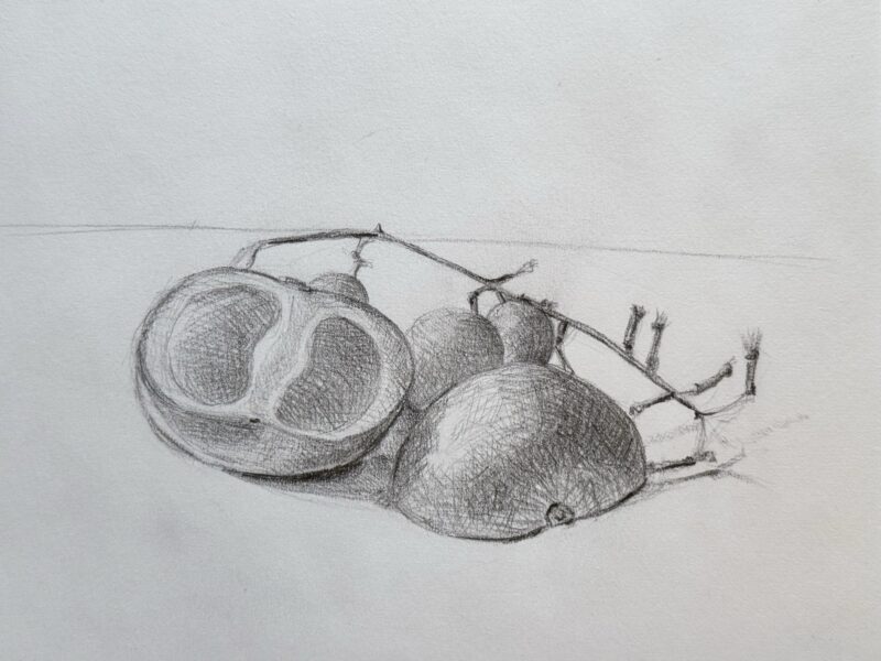
I feel I’m just scratching the surface (!) when it comes to Thiebaud’s paintings. I find his use of paint, texture, brushstrokes and his still life paintings really enthralling. I like how he creates characters out of these unique objects and he uses minimalist backgrounds to showcase them. There’s a clarity as well as a sense of order which I find calming and at the same time, there is a feeling that he’s tantalising us and reminding us how we cannot succumb to these little pleasures (we can’t eat his paintings!). There is a sense of exchange with the audience and relatability that I find very inspiring. I would love to connect with my viewers in this way through my paintings one day.
References
Christie’s (n.d.) Pinball wizard: A closer look at the masterful art of Wayne Thiebaud. Available at: https://www.christies.com/en/stories/pinball-wizard-a-closer-look-at-the-masterful-art-of-wayne-thiebaud-12813f91c9aa44d687509f36b71c9d0b (Accessed: 4 February 2026).
Halcyon Gallery (n.d.) Andy Warhol: Campbell’s soup cans – 5 things to know. Available at: https://www.halcyongallery.com/news/108-andy-warhol-campbell-s-soup-cans-5-things-to-know/ (Accessed: 4 February 2026).
Kitaoka, A. and Ashida, H. (2003) ‘Phenomenal characteristics of the peripheral drift illusion’, Vision, 15, pp. 261-262. https://doi.org/10.24636/vision.15.4_261
Serres, K. (2025) ‘Cakes, 1963’, in Teagle, R. (ed.) Wayne Thiebaud: American still life. London: The Courtauld in Association with Paul Holberton Publishing, p. 120.
Smith, C. (n.d.) Homage to Wayne Thiebaud: In conversation with Colin Smith. Artlyst. Available at: https://artlyst.com/homage-to-wayne-thiebaud-in-conversation-with-colin-smith/ (Accessed: 4 February 2026).
Teagle, R. (2025) Wayne Thiebaud: American still life. London: The Courtauld in Association with Paul Holberton Publishing.
1 Comment
Add Yours →[…] Contrast with: Wayne Thiebaud […]